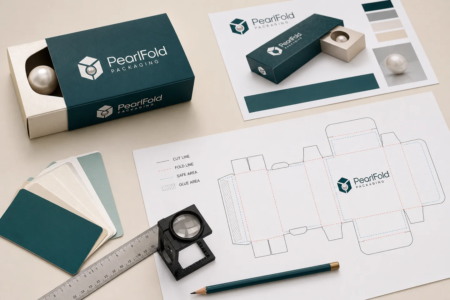
Packaging artwork should be built on the approved production dieline for the exact box structure and size. The file needs clear cut, fold, bleed, safe-area, and glue guidance; organized print and finish layers; linked or embedded production assets; and a reference PDF that shows the intended result. A generic template or visual mockup is not a substitute for the confirmed dieline.
This guide describes a practical prepress workflow for beauty and personal-care packaging. Final file requirements can vary by project, so follow the instructions supplied with the approved dieline and written specification.
What is a packaging dieline?
A dieline is the flat structural drawing used to position artwork on a package that will be cut, creased, folded, and assembled. It identifies panels, flaps, seams, cut edges, fold lines, and non-printing construction areas. The finished box may look simple, but the flat file contains every surface and connection needed to create it.
The dieline should correspond to the approved product dimensions and structure. Scaling a different carton or downloading a generic outline can change panel sizes, flap geometry, and closure behavior. If the product or insert changes, confirm whether the dieline still fits before continuing artwork.
How should cut, fold, bleed, and safe areas be used?
Cut lines show where the sheet is intended to be cut. Fold or crease lines show where panels turn. Bleed extends background color or imagery beyond a cut edge so normal production variation does not expose an unintended unprinted line. Safe areas keep critical information away from cuts, folds, and other risk zones.
Keep structural guides on clearly named non-printing layers and follow the supplied color conventions. Do not recolor, move, or delete structural geometry to make the file look cleaner. If a guide is unclear, ask before placing final artwork.
How should artwork be organized in the working file?
Use a predictable layer structure: dieline guides, base artwork, variable copy, linked imagery, white ink or special plates where applicable, foil, emboss/deboss, and notes. Name every special treatment according to the production instruction. Keep vectors editable when required and avoid flattening the only working version.
Remove hidden experiments, unused swatches, duplicate objects, and outdated artwork before handoff. A clean file reduces ambiguity, but it should not discard information needed for production. Preserve one dated source of truth and export a reference PDF from the same version.
Where should important copy and barcodes be placed?
Place logos, product names, supplied regulatory or legal copy, barcodes, and fine text inside the approved safe zones. Keep them away from folds, glue areas, closures, and heavily curved or interrupted surfaces. Check panel orientation after assembly so text does not appear upside down or on an unintended face.
Barcode size, contrast, quiet zone, and verification should be reviewed by the brand’s qualified team and applicable provider. Do not use a decorative mockup as proof that a code will scan. Supply the correct code artwork and include it in the preflight record.
How should color and images be prepared?
Use the color mode, profiles, spot colors, and naming conventions requested for the project. Define brand colors with approved references rather than relying on one monitor. Images should have sufficient effective resolution at final placed size and should not be enlarged beyond a defensible source.
Check links, transparency, overprint, rich black or single black use, fine reverses, and small type against the production requirements. A screen preview cannot reproduce substrate color, ink behavior, metallic foil, texture, or coating. Review the applicable proof or sample.
How are foil and embossing files prepared?
Special finishes normally require separate vector plates with unambiguous names. Artwork should use solid shapes appropriate to the process rather than visual effects that exist only in the design application. Keep fine lines and small counters within the supplier’s confirmed capability for the selected material and method.
If foil and embossing register together, show their intended relationship in the reference PDF and maintain separate production layers. Do not place critical effects across unconfirmed folds or edges. The printing and finishes guide explains how hierarchy should lead these choices.
What should a preflight check include?
| Check | Question |
|---|---|
| Structure | Is this the approved dieline, size, and version? |
| Guides | Are cut, fold, bleed, safe, and glue areas intact and non-printing? |
| Copy | Has every panel been proofread by the authorized owner? |
| Assets | Are fonts, links, images, and vectors present and production-ready? |
| Color | Are process and spot colors named and configured correctly? |
| Finishes | Are special plates separate, clear, and reflected in the reference? |
| Assembly | Is panel orientation correct on the finished structure? |
What are the most common dieline artwork errors?
- Using an outdated or generic structural template
- Scaling the dieline without structural approval
- Missing bleed on background artwork
- Placing copy too close to cuts, folds, or glue areas
- Leaving special finishes as raster effects or unnamed objects
- Supplying missing links or unlicensed fonts
- Failing to check panel orientation after assembly
- Approving from a screen mockup without reviewing the production proof
How should the final artwork handoff be packaged?
Supply the editable source file in the requested format, linked assets, font solution, and a reference PDF. Include the product, SKU, dieline version, artwork version, and date in descriptive filenames. Add a short handoff note listing spot colors, special finishes, and any item still awaiting confirmation.
Keep approval traceable. The person authorizing production should review spelling, supplied legal and product copy, barcodes, colors, panels, finishes, and quantities. Changes after approval can affect feasibility, cost, and schedule.
What should happen before production approval?
Compare the proof or sample against the approved artwork and written specification. Confirm that structural guides were not printed, panels align, copy is complete, and special treatments appear in the intended positions. Record the approved version and retain it with the project documentation.
Download the PearlFold artwork checklist and review the dielines and templates guide before handoff. If the product, dimensions, quantity, and artwork status are ready, request a custom packaging quote so the dieline and production scope can be discussed against the real project.
How should a multi-SKU range use one dieline?
When several SKUs share the same confirmed container and carton, create a controlled master artwork system. Lock common elements such as panel hierarchy, logo position, shared copy zones, and finish plates. Keep variant fields in a schedule that identifies product name, color, barcode, and other supplied differences.
Do not assume every SKU shares the same structure because the nominal product volume is similar. Confirm the production container, closure, and required copy for each item. If one SKU needs a different depth or insert, give it a distinct approved dieline and file identifier.
What is the role of a reference PDF?
A reference PDF shows how the design team expects the production file to appear. It should include all visible panels and, where useful, notes for special finishes. It helps reviewers catch missing links, disabled layers, or unexpected output when the source file is opened in another environment.
The PDF does not replace the editable production artwork or structural file. Label it as a reference, include the same version identifier, and regenerate it whenever the source changes. Conflicting PDFs and source files should never be sent together without a clear explanation.
How should version control work during artwork review?
Use one naming convention that identifies brand or project, product, component, dieline version, artwork version, and date. Store superseded files outside the active handoff folder. Record who requested each change and who approved the final version.
Email threads can document decisions, but they should not become the only source of truth. Maintain a concise approval record that points to the exact files. If copy changes after proofing, issue a new version and repeat the affected checks.
What should designers check on a folded mockup?
A folded mockup reveals panel sequence, reading direction, seam placement, edge relationships, and how much of the artwork is visible at one time. Review the front, sides, back, top, bottom, and opening path. Confirm that the visual hierarchy survives the transition from flat layout to three-dimensional package.
A paper mockup is useful for orientation but may not reproduce production material, print, or finishes. Label what it proves and what it does not. Use the appropriate proof or sample for color, texture, registration, and structural fit.
How can prepress questions be resolved faster?
- Mark every open item directly in a dated review list
- Use screenshots only to point to the source-file location, not as replacement artwork
- Name the panel, layer, color, or finish involved
- State whether the issue affects content, appearance, structure, or production feasibility
- Keep one authorized person responsible for supplied copy
- Return consolidated comments instead of conflicting individual markups
- Confirm every resolved item in the next version
Specific comments reduce interpretation. “Move the supplied net-contents line 2 mm inside the confirmed safe area on the back panel” is easier to resolve than “the bottom text feels wrong.” The packaging team can then check the requested change against the dieline and specification.
Before closing the review, compare the final source file, reference PDF, comment log, and approval note side by side. Their version identifiers should match, and no unresolved markup should remain. This final reconciliation is a small step that prevents an approved comment from being separated from the file it was meant to change.